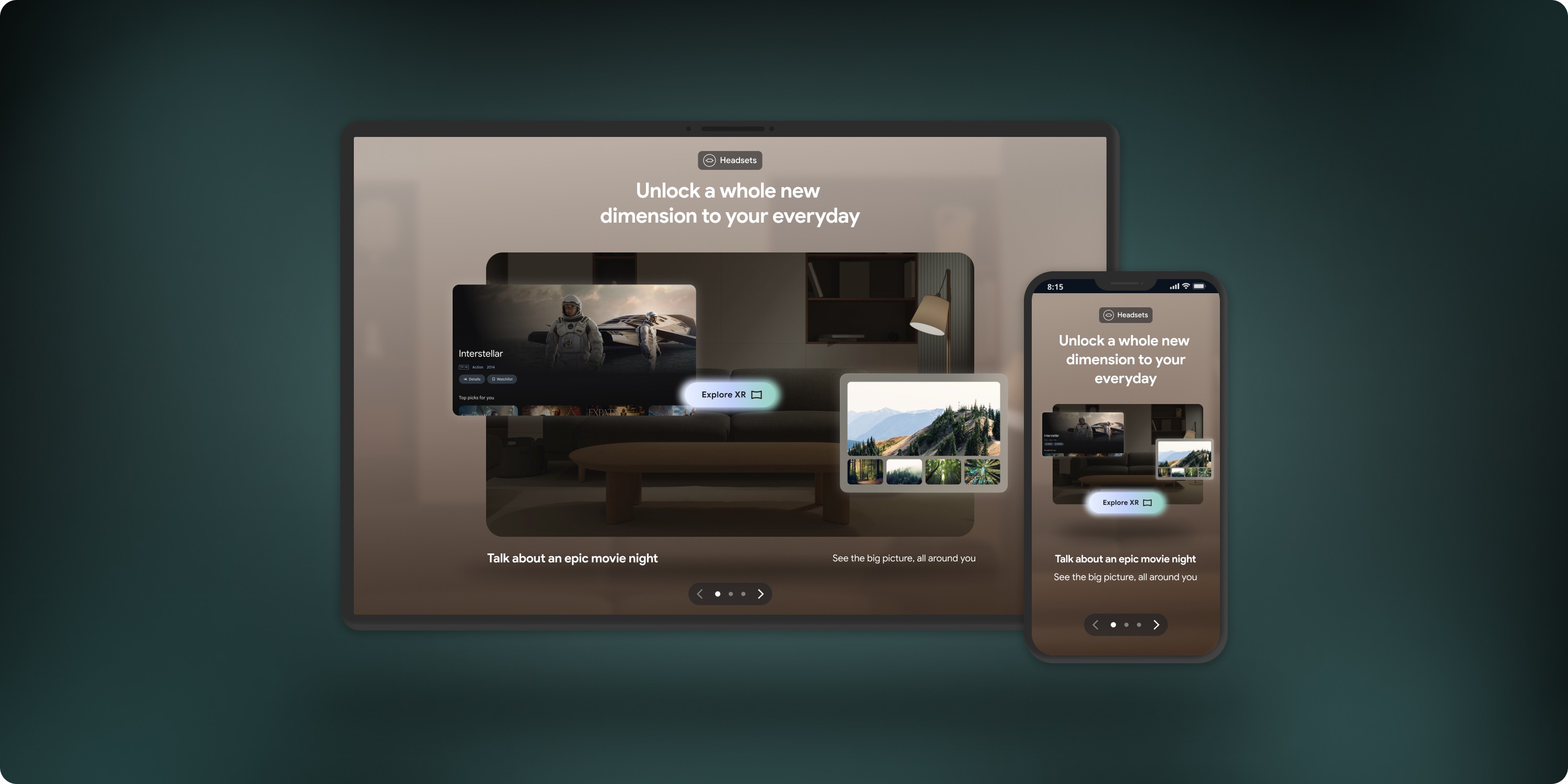
YouTube Blog
Designing a next-gen blog experience that drives discovery

Duration
2024 | 6 months
Role
UX Lead
Responsibilities
Competitive analysis, Wireframes, Interaction Design, Accessibility, Design system, Documentation, Handoff
Overview
YouTube's blog is a central hub for news, updates, and inspiration in the community. But as YouTube's brand evolved, the blog lagged behind. Our mission was to make their blog feel younger, more dynamic, and boost article discovery among Gen Z's.
As the UX lead on this project, I evolved the site experience to align with YouTube's brand values and engagement goals. In this end-to-end process, I delivered a unified blog journey and new interactive components that make it easy to discover fresh content.
Problem
First things first, we needed to understand why the current blog wasn’t performing well. We audited the current designs, researched other blogs, and dug deeper into page analytics to identify three key issues:
Limited functionality: Surfacing content in a ‘what you see is what you get’ manner, users had little control over what they saw or could filter for on the homepage.
Page layout and length: Inefficient layouts and and dead space created long pages with low scroll rates. The drop off rate was especially high after the hero, with little article engagement.
Fragmented branding: Inconsistent visuals and typography across the site made for a disconnected and uninspiring experience.

Early ideation
From here, we established a page structure with new modules and features to promote article engagement based on the following HMW questions. We wireframed component variants to quickly test different layouts and hierarchies.

HMW increase engagement on page, especially in the hero?
HMW surface more articles without increasing page length?
HMW help users find content they like more easily?

Full-page wireframes
We selected components based on those that were effective on mobile (50% of visits) and showcased more articles with less scroll. Interactive elements like filters, tags, and navigational buttons were prioritized to give users more control over finding content they like.
With the need to capture users' interest and counter high drop off rates upon page visits, we designed the hero to show more articles in an interactive and seamless manner. We also reduced the height of the hero, showing filters from the next section on page to build curiosity and encourage users to scroll to see more.

We needed to ensure that our designs were flexible enough to accommodate all images ratios that the blog received without cropping. Through iteration and lots of testing, we developed a flexible card component that could be used in the hero and across the blog in a visually pleasing manner.
We also leaned into using videos, especially YouTube Shorts, as a new way for users to preview article cards. Not only does this create a unique blog experience that is both video and article based, but also amplifies brand connections to the YouTube platform.

Unifying the site
Through positive client relationships and quality work, YouTube was eager for us to continue the redesign on their category and article pages. This new scope of work consisted largely of applying the new brand, adapting components that were approved during the homepage work, and using data analytics to support changes to content hierarchy.
Establishing a strong design system made this work easier, as we already had many building blocks and their interactive states. To make the experience even more engaging, we explored micro-interactions for cards and filters. We documented all component and interaction behaviours for our development team to streamline handoff and production.

Results
We transformed a stagnant blog site into a fresh, connected experience with more possibilities for engagement and discovery. The cherry on top is a new design system with flexible functionality and three page templates that YouTube can continue to use as they grow their blog.
3 flexible templates: Designed to adapt seamlessly to diverse needs—from homepages to articles—each template is built to inspire and perform.
24 component enhancements: With 11 bold new features and 13 reimagined elements, every detail is crafted to amplify functionality and delight.
1 unified design system: A fresh, cohesive aesthetic applied across the blog ensures every element works in harmony, today and into the future.

Learnings
Working with rejection
During feedback rounds, YouTube rejected our interactive card-swiping hero. They wanted the homepage hero to use an editorial grid layout to showcase more articles. While we had concerns, we revisited our explorations with their feedback.
The next week, we presented their idea across different breakpoints, highlighting its limitations for responsiveness. We followed with our own recommended hero—now live on the site—responding to the goal of surfacing more articles without extending scroll length on mobile. We also supported this with industry examples to illustrate its effectiveness.
This experience reinforced the importance of being receptive and flexible while advocating for the best design solutions, ultimately strengthening our client relationship and building trust in our ability to balance their goals with usability.
Prioritizing features based on imapct
In line with advocating for the best UX, we designed several new interactive components to help users discover content. YouTube was excited by these proposals, but the work to develop all features would extend beyond our set timeline. As a result, I collaborated with my product manager and development team to assess levels of effort and prioritize features promising the highest impact for user engagement. We successfully brought these recommendations to YouTube, outlining an MVP design for launch and features to be developed in the future.